SPMA082 August 2021 TM4C1230C3PM , TM4C1230D5PM , TM4C1230E6PM , TM4C1230H6PM , TM4C1231C3PM , TM4C1231D5PM , TM4C1231D5PZ , TM4C1231E6PM , TM4C1231E6PZ , TM4C1231H6PGE , TM4C1231H6PM , TM4C1231H6PZ , TM4C1232C3PM , TM4C1232D5PM , TM4C1232E6PM , TM4C1232H6PM , TM4C1233C3PM , TM4C1233D5PM , TM4C1233D5PZ , TM4C1233E6PM , TM4C1233E6PZ , TM4C1233H6PGE , TM4C1233H6PM , TM4C1233H6PZ , TM4C1236D5PM , TM4C1236E6PM , TM4C1236H6PM , TM4C1237D5PM , TM4C1237D5PZ , TM4C1237E6PM , TM4C1237E6PZ , TM4C1237H6PGE , TM4C1237H6PM , TM4C1237H6PZ , TM4C123AE6PM , TM4C123AH6PM , TM4C123BE6PM , TM4C123BE6PZ , TM4C123BH6PGE , TM4C123BH6PM , TM4C123BH6PZ , TM4C123BH6ZRB , TM4C123FE6PM , TM4C123FH6PM , TM4C123GE6PM , TM4C123GE6PZ , TM4C123GH6PGE , TM4C123GH6PM , TM4C123GH6PZ , TM4C123GH6ZRB , TM4C1290NCPDT , TM4C1290NCZAD , TM4C1292NCPDT , TM4C1292NCZAD , TM4C1294KCPDT , TM4C1294NCPDT , TM4C1294NCZAD , TM4C1297NCZAD , TM4C1299KCZAD , TM4C1299NCZAD , TM4C129CNCPDT , TM4C129CNCZAD , TM4C129DNCPDT , TM4C129DNCZAD , TM4C129EKCPDT , TM4C129ENCPDT , TM4C129ENCZAD , TM4C129LNCZAD , TM4C129XKCZAD , TM4C129XNCZAD
3.1.3 Widget API Overview
Above the low-level graphics API and the input driver, the widget API offers a high-level interface that allows the programming to build a complex user interface that includes individual control such as buttons, sliders, checkboxes, and other high-level widgets (controls).
Table 3-2 shows the widget classes supported by TivaWare Graphic Library.
| Widget | Source File | Description |
|---|---|---|
| Canvas | canvas.c | The canvas widget provides a simple drawing surface that provides no means for interaction with the user. The canvas has the ability to be filled with a color, outlined with a color, have an image drawn in the center, have text drawn within it, and allow the application to draw into the canvas. |
| Checkbox | checkbox.c | The checkbox widget provides a graphical element that can be selected or unselected, resulting in a binary selection (such as “on” or “off”). A checkbox widget contains two graphical elements; the checkbox itself (which is drawn as a square that is either empty or contains an “X”) and the checkbox area around the checkbox that visually indicates what the checkbox controls. |
| Container | container.c | The container widget provides means of grouping widget together within the widget hierarchy, most notably useful for joining together several radio button widgets to provide a single one-of selection. The container widget can also provide a visual grouping of the child widgets by drawing a box around the widget area. |
| Image Button | imgbutton.c | The image button widget provides a button that can be pressed, causing an action to be performed. An image button is defined using a background image, a pressed-state background image, a keycap image and, optionally, a text string. The use of independent background and keycap images can offer memory saving in some applications which wish to show many similar buttons. |
| ListBox | listbox.c | The listbox widget allows the user to select one from a list of several strings held by the widget. The touch screen can be used to select and deselect a string by tapping it or to scroll through the strings in the listbox by pressing and dragging on the screen. Whenever the selected element in the box changes, a message is sent to an application callback informing it of the new selection (or lack thereof). |
| Keyboard | keyboard.c | The keyboard widget allows the user to create an on-screen keyboard for entering text without an external keyboard. The touch screen can be used to handle the pointer for selecting keys. Whenever a key is pressed a message is sent to the application callback to allow the application to handle the newly pressed key. The keyboard widget does not handle printing any of the keys as they are pressed, leaving all processing of keys to the application. |
| Push Button | pushbutton.c | The push button widget provides a button that can be pressed, causing an action to be performed. A push button has the ability to be filled with a color, outlined with a color, have an image drawn in the center, and have text drawn in the center. Two fill colors and two images can be utilized to provide a visual indication of the pressed or released state of the push button. |
| Radio Button | radiobutton.c | The radio button widget provides a graphical element that can be grouped with other radio buttons to form a means of selecting one of many items. For example, three radio buttons can be grouped together to allow a selection between “low”, “medium”, and “high”, where only one can be selected at a time. A radio button widget contains two graphical elements; the radio button itself (which is drawn as a circle that is either empty or contains a filled circle) and the radio button area around the radio button that visually indicates what the radio button controls. |
| Slider | slider.c | The slider widget allows the user to drag a marker either horizontally or vertically to select a value from within an application-supplied range. |
The widgets are organized in a tree structure, and can be dynamically added or removed from the active widget tree. The tree structure allows messages to be delivered in a controlled manner. Each message is delivered in either top-down or bottom-up order based on the semantics of the message.
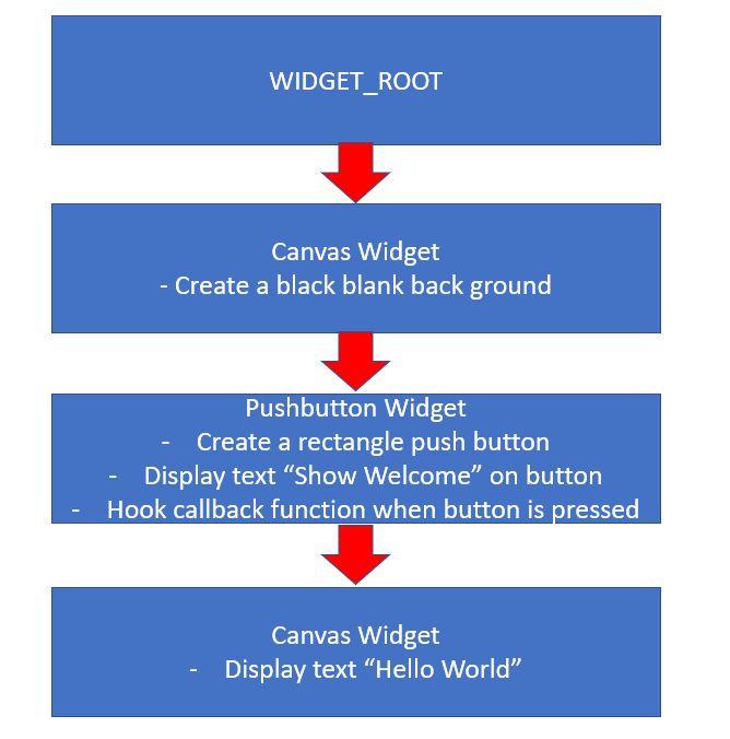
Using hello_widget.c as an example, it has a widget tree with four levels starting from WIDGET_ROOT shown in Figure 3-2.
 Figure 3-2 Example Widget Tree
The widget layer ties the graphic display to the input system. It manages the input and updates the displayed widgets according to button or touch screen presses made by the user. Application interaction with widgets is via callback functions provided during initialization. These callbacks are specific to the type of widget but would include functions called when a button is pressed or a slider is moved.
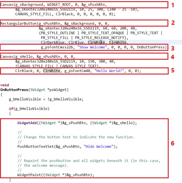
Figure 3-3 shows some of the attributes of the hello_widget.c example code on how widgets are declared and how the callback function is called when a touch event is detected.
- Declare a canvas widget named g_sBackground. Its parent is WIDGET_ROOT. It has no sibling widget but has a child widget called g_sPushBtn.
- Declared a push button widget named g_sPushBtn. Its parent is g_sBackground. It has no sibling and neither a child widget.
- This g_sPushBtn push button widget will display text “Show Welcome”. A callback function OnButtonPress is hooked to this widget.
- Declare a canvas widget named g_sHello. Its parent is g_sPushBtn. It is no sibling widget and neither a child widget.
- The g_sHello canvas widget will display text “Hello World” on the display at the specified coordinates. This widget is not hooked into the active widget tree (by making it a child of the g_sPushBtn widget) yet since it is not intended for the widget to be displayed until the button is pressed.
- When the button is pressed, the callback function OnButtonPress is called. In the function, it first adds the g_sHello as a child to the g_sPushBtn widget. It then changes the text attribute of the g_sPushBtn widget from “Show Welcome” to “Hide Welcome”. Lastly, a call to repaint the push button widget and all widgets beneath it (In this case, the g_sHello widget that will print “Hello World” on the display.
 Figure 3-3 Example Code Analysis
The widget framework provides a generic means of dealing with a wide variety of widgets. Each widget has a message handler that responds to a set of generic messages; for example, the WIDGET_MSG_PAINT message is sent to request that the widget draw itself onto the screen.